Hello everyone, and welcome back to another edition of Box Art Brawl!
Before we get cracking with this week's battle, let's see how things panned out last time. We looked at Turok 2: Seeds of Evil for the N64 and golly gosh, was it a close one. It seemed many of you weren't too keen on either design, but ultimately, it was the western variant that won the day with 51% of the vote.
This time, with the full reveal of Metroid Prime 4: Beyond fresh in our minds, we're checking out the last mainline game in the series: Metroid Prime 3: Corruption. Launched for the Wii in 2007, it took full advantage of the console's motion controls for a sublime gameplay experience that felt natural and evolutionary (just make sure to switch the motion controls to 'advanced'!).
We've got another duel on our hands this time, with North America and Europe teaming up to take on Japan. So without further ado, let's get on with it.
Be sure to cast your votes in the poll below; but first, let's check out the box art designs themselves.
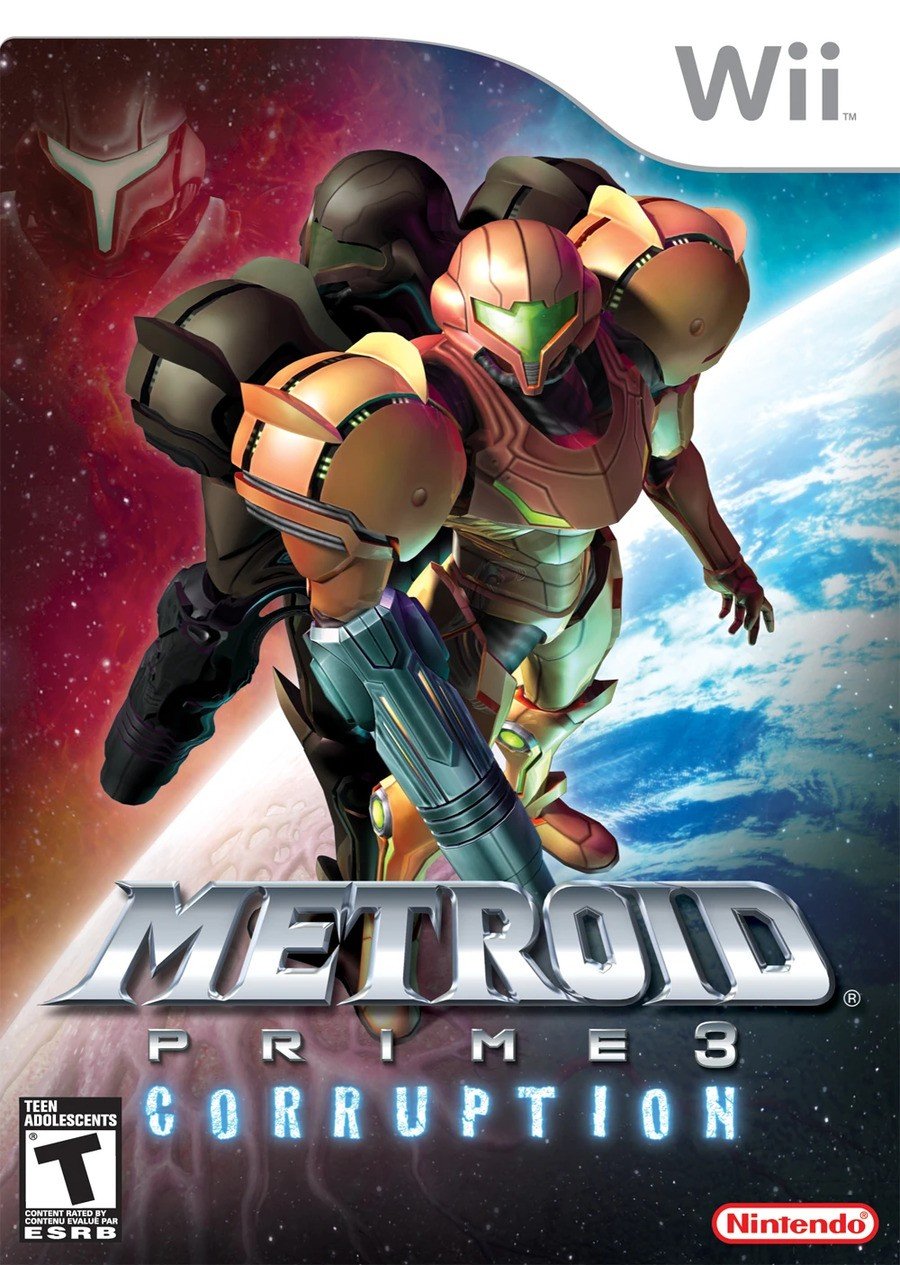
Europe / North America

The western design for Corruption play heavily into the dynamic between Samus and Dark Samus, with the two standing back-to-back against a beautiful background set in space. Granted, we're not sure why there's a disembodied image of Dark Samus again in the top left, but heck, we'll take it.
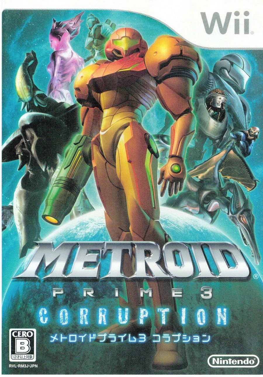
Japan

The Japanese variant, meanwhile, features almost all of Corruption's main players, including Samus, Dark Samus, Meta Ridley, and the three hunters: Rundas, Ghor, and Gandrayda. Oh, and a little Federation soldier at the back, there. Cute. We love the composition of this one, but does it hold up to the awesome light vs. dark dynamic of the western design..? Hmm.
Which region got the best Metroid Prime 3: Corruption box art? (2,747 votes)
- North America / Europe

- Japan

Thanks for voting! We'll see you next time for another round of Box Art Brawl.


Comments 56
I dislike them both, but EU/NA is just... awful.
They're both good, but EU/NA is just a bit better for me.
Absolutely Japan for me as based on what I've heard having all those characters around is one of the things that distinguishes Corruption from previous Prime games... and even if I were wrong about that I always prefer box art that show the contents (characters, locations, gameplay etc.) of the game so it would still win.
Yeah definitely going with NA/EU this week. While I don't hate what they were going for with the Japanese boxart, it ultimately feels a bit too....generic for my tastes. The NA/EU one on the other hand feels very memorable and shows off the main element of the game (Dark Samus) in a pretty novel way, with both Samus's standing back-to-back against the red vs blue background. I wouldn't call it incredible or anything but its much more visually appealing than the Japanese one if you ask me.
@Daniel36 @Yosher The duality of man.

That’s not Dark Samus standing back to back with Samus, it’s just a reflection of Samus (they look exactly alike, which Samus/Dark Samus does not). Which makes the box art weird, in my opinion, it doesn’t really make sense.
@Fizza LOL how did I miss that. Thanks for the chuckle.
Also you described my feelings for the box arts pretty much on point. JP one isn't terrible by any means but it feels more generic, and less Metroid-y. Metroid is a series you'd probably want to avoid making such relatively generic group shots for, I think.
@SirKif
It would be better if it was Dark Samus instead of just a gooey dull Samus while Dark Samus randomly looms over the corner.
Both look like a tawdry straight to VHS (look it up kids) movie sequel.
I feel like both of these are pretty bad.
I'm very surprised once again. I thought that everyone would vote for the japanese one
JP one for me, 'cause it shows more characters, yep.
Omg I have never seen the Japanese box and now that I have I am in love!
Corruption is sooooo good. Easily my favorite Prime game, and I think the only one in the series that nailed the combat
US/EU one would’ve been better with just Samus and Dark Samus back to back. It’s a pretty bad cover as is. I get the idea of having a shadow of Samus since Dark Samus isn’t the embodiment of her “corrupted” side but still, it’s overkill having the face of Dark Samus floating there too.
Japan one isn’t great either but it’s better than what we got
I do like that the Japanese artwork shows more of the characters and gives more of an indication of the narrative, but I just prefer the European version overall. Dark Samus is much more important than the Hunters and the Japanese box diminishes her position. I also prefer the perspective of the European box, looking down at the characters instead of up. In real life that would be a highly unflattering selfie.
japan loves their "heroes and villains crammed into an elevator" cover art concepts.
NA for me this time. 👍 though as someone already said, the 3rd face on the cover just kind of taking up the margin in the top left was an odd choice.
NA for me, but I just saw the disembodied head, and gotta say that it really sullies the box
Japan's feels a little cluttered, but it does show all the important characters of the game which is nice.
I really don't like either one very much.
But likewise, I really dislike Corruption as a game, though I love Prime and Echoes. Echoes is still one of my favorite games of all time and Corruption was THE reason I bought a Wii, but what a letdown of a game. I sure hope Prime 4 doesn't feel like Prime 3. Metroid is one of my all time favorite series, but I rank Prime 3 right near the bottom.
Box Art Brawls Current Total:
Europe: 80
Japan: 77
North America: 91
Australia and New Zealand: 1
I chose Japan - more accurate to the actual game with those add-on characters.
I didn't finish or really enjoy this game much.
I always thought the boxart was a little weak for this one compared to the first 2 games. I like the perspective and the idea behind it but that reflection in space is just weird and it lacks a little oomph tbh.
Japan has some merit, its more colorful vibe and characters show more of the actual atmosphere of the game.
JP makes me want to find out about these bozos.
West makes me scratch my head (it has the nicer colours though).
Honestly, drab as the EU/US boxart is I think it's a better fit than the rather cluttered composition on Japan's. Even though the ensemble cast was larger than usual in Corruption you still spent vast swathes of the game soaking in that good 'ole Metroid isolation. The first one captures that a wee bit better.
They're both kinda boring
I like both this time around, but I went with the more simplistic NA/EU design. I quite like the contrasts between Samus and her dark reflection. While it's cool that some of the other characters make an appearance on the JP art - the additional bounty hunters are one reason why MP3 is my favorite Prime game - they make it a bit busy in comparison.
I love the North America one, I'm surprised so many people don't like it.
The Japanese one has too much going on. As the worst game in the trilogy I'll choose NA/Europe this time.
I don't exactly love either but the japanese cover in particular is too busy and boring too at the same time.
Japan’s is waaaay better. There’s nothing going on in the Western cover, it’s just Samus three times for some reason.
Japan's is more traditional with the hero posing, and the cast of villains arranged behind her, whereas the NA cover is more evocative of the 'corruption' theme of the game with Samus standing with her back to her dark reflection. I don't mind either, but I think both would be better if they were hand drawn illustrations as opposed to using the game models.
NA/Europe. Japan's looks like a space fashion show, and while that has its own weird attraction, the other is more gamey.
And the litany of "Both of these suck" comments. C'mon, now.
I'm not huge with either, but I'm going with JPN this week because of the larger cast.
And once again NL labels an NA/EU release as EU/NA... (It was developed, and launched first, in NA, so that region should get top billing in a shared art).
I've missed these Box Art Brawls for a while, that's what happens when you're busy on a Sunday), but not for one of my favorite series.
My vote goes for the Japanese one, simple because it shows the important characters (except for that GF Trooper, but the Federation in general plays a slightly bigger role here than in other Prime games at the time). It tells you something is gonna happen with them.
Besides, anything showing Rundas gets my instant approval.
I feel the western cover works better as a disc art (as seen in the Japanese version's disc). But like mentioned, it would be better if it were Samus and Dark Samus back-to-back or if Samus was back-to-back with a 25%-50% corrupted Samus.
Disc art

North America (shared with Europe, only with different logos), remember this was before we had colored discs around mid-2009.
Japan

As much as I enjoy when box art goes all out featuring a game's core cast, think the North American/European art better captures the more serious/somber tone of the Prime series.
They both suck, but, JP cover at least shows most of the characters the game has.
Japan, only for the meme. About the height of my days reading Kotaku, I just remember them asking what the grammatically correct way to describe the cover was.
How do we talk about multiple Samus? Are they Samuses or are they Samii?
The Japanese one looks like an anime. Which means it looks terrible. This is a very easy decision.
Crud their both good. But I’m gonna go with the JPN version since it shows the other bounty hunters. Or I think those are the bounty hunters..
@sketchturner I think you might be in luck, since Tanabe discussed what he wanted to do with Prime 4 with Eurogamer in a 2015 interview and mentioned wanting to go back to the concept of Echoes, but with a different spin put on it: instead of a light and dark world, he mentioned wanting to have you traverse the same location in different time periods
@sketchturner Same story here. I loved the Prime games on Gamecube. Prime 3 was the main reason I got the Wii and it was a huge disappointment. I found the motion controls annoying and a barrier to immersion and enjoyment.
The Western art needs at least 5 more Samuses.
Since the writer mentioned the motion controls, I'll just briefly say I hated them. Sublime? Not for me.
The western cover has way better composition than the Japanese cover. I agree the Japanese cover is cluttered. The layer behind Samus is a mess. There's also a terrible use of space, and I don't mean cramming everything into frame as a use of space. Everything is on top of other things and there's no space between anything at all as it's all pushed right to the edge of the frame. The western cover has a lot of breathing room which I find makes it far more pleasant visually and it easily my pick for this week.
European/American cover is very generic the Japanese one is nice but I'd prefer a proper classic 2D cover art over 3D one.
I'm late to the party I guess, but I like them both, I can't make up my mind. Just they seem to be from two different games.
Neither's great but I prefer the Japanese one.
As much as it'll hurt my nostalgia, I'll go with the Japanese one this time
Metroid Prime Trilogy steelbook FTW
It's like for the US, the designer didn't get the note that shadow Samus was supposed to be Dark Samus, but there wasn't time to fix it, so they added her face in the corner to say "This is who it's supposed to be, sorry."
I've never liked the NA cover compared to MP1 and 2's covers-- It just looks like they never tried. Samus standing there, her OWN reflection looking back (???), and THEN Dark Samus in the background equals Corruption? O-kaay. I loosely blame my blah interest in this entry in part to the cover lol. Now the JP boxart brings some serious life into the image, great or not.
@sdelfin I liked the Wii pointer controls but not the motion controls. But the biggest fail to me was the disconnected planets compared to having one big world to traverse. Even setting that aside, I didn't find the level design of most areas to be really interesting too explore. Pirate Homeworld was pretty cool and periodically there were individual "rooms" I liked within other planets but most of it felt really uninspired.
Neither are great. How dumb is it to have basically have three images of Samus. I sorta remember back in the day when somebody edited like five other copies of Samus into this to make it even "better."
While I usually prefer "busier" covers, I'll go with the Western art in this case over "Samus and her weirdly-shaped friends".
@Uncle_Franklin : I've already pointed this out before, but as long you're tallying art shared between Europe and NA, why do you keep simultaneously listing yet ignoring Australia when our art is usually identical to that of those two regions?
@SillyG
I go by the categories listed by Nintendo Life.
You can view that as an occasion when Australia was listed separately, and won.
Wanted to go with nostalgia and say MA but I gotta go with Japan it shows off all the castand I love that
Honestly, Metroid Prime 3's Western box art is just as bland as the Western box art for Metroid Prime 1. It's just Samus standing there again, except now she has a reflection that is supposed to represent the corruption in her body, but it looks so uninteresting. If I could change a few things, I would give Samus the PED suit, since the Varia suit is basically gone after the intro, and for her reflection, maybe show Phazon glowing from the crevices in the suit and make her visor glow blue like she's using hyper mode. Lastly, I'd put the other bounty hunters in the background, but in a way that hopefully wouldn't look like a cluttered mess like in the JP box art.
Tap here to load 56 comments
Leave A Comment
Hold on there, you need to login to post a comment...